100 Days of UI Challenge - User Profile
Designed a user profile page for a proprietary smart ring — the ONERING — as part of the 100 Days of UI Challenge
- Client
- Personal Project
- Role
- UX/UI Designer
- Years
- 2026
Challenge
As a regular user of health tracking applications (i.e. RingConn's health app, Health, Google Fit), I had observed that said apps often did not have "challenges" that users could opt in to or join. Samsung Health had global challenges where users could attempt to hit goals along with their friends and other members of the community, but this feature was not available in other health apps. I think a possible reason is that challenges have a natural tension with preserving one's mental wellbeing (which is also monitored by health trackers sometimes).
Given this, I needed to clearly communicate to users that participation in challenges is not mandatory, and is only an option for those who want to push themselves even further.
Action
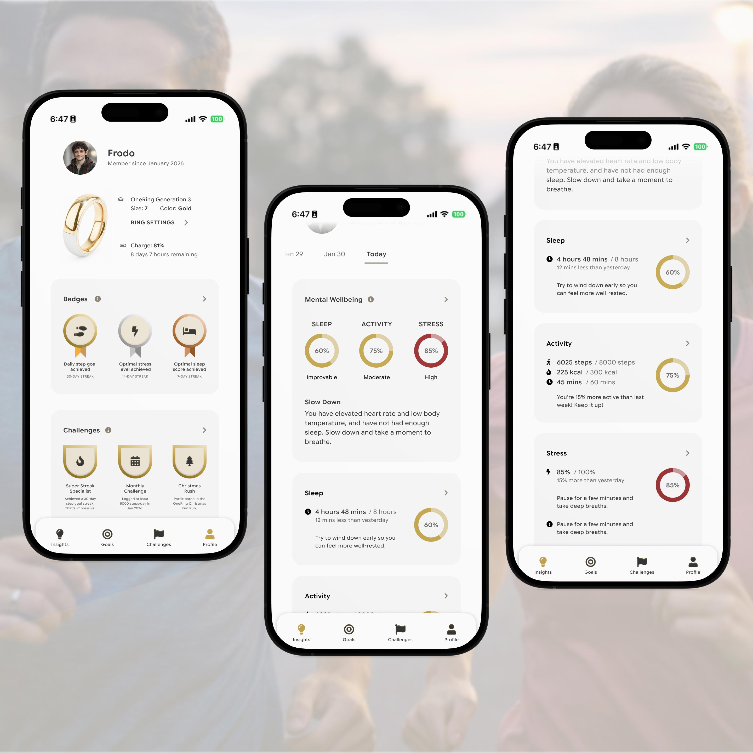
Following the thinking above, I designed a user profile that captures both milestones that users are able to achieve through consistency, and challenges that users are able to triumph over by overcoming their limits and discovering new strengths. This simple gamification of health achievements can help make maintaining health goals less daunting and more enjoyable.
To remain consistent with ONERING's branding, I used gold and brown as highlight colors, with deep red as the only deviation to denote a negative state (i.e. high stress). I employed simple iconography to keep the layout looking clean and allow users to focus on the content without overwhelming them with design elements. You can check out the Figma prototype in the link above.
I wonder if Sauron will ever be interested in tracking sleep apnea signals...