100 Days of UI Challenge - Checkout
Designed a checkout page for a proprietary smart ring — the ONERING — as part of the 100 Days of UI Challenge
- Client
- Personal Project
- Role
- UX/UI Designer
- Years
- 2026
Challenge
The second theme for the 100 Days of UI challenge was "checkout". Checkout pages must clearly communicate what is being purchased, the price, and any discounts that may be applied or promotions wherein the product to be purchased is eligible. There is no need to request shipping and billing information yet — we are simply asking the user to confirm if they want to proceed with their purchase at this time, not asking for money. Challenge #1 was figuring out how to achieve all these while still making the page look attractive.
Challenge #2 was figuring out what product or service to use for this exercise. As I had been highly interested in smart rings at that time, I decided to create a product — the ONERING that will rule them all.
Action
The best solutions are often the most simple ones. In this case, I kept the layout simple and streamlined.
For desktop, I kept the interactions on one side to keep the user focused. I placed all product and purchase information on the right, following the natural reading habits of most people (left to right, with most static elements remaining on the left).
I made sure to keep the UX cues nuanced, in alignment with the minimalist and elegant theme. I placed the most important information (i.e. product info and prices) in a pure white card with drop shadow, then placed the product perks in a separate card with the same background color as the rest of the page, made to pop out with drop shadow. Subtle visual adjustment, big impact.
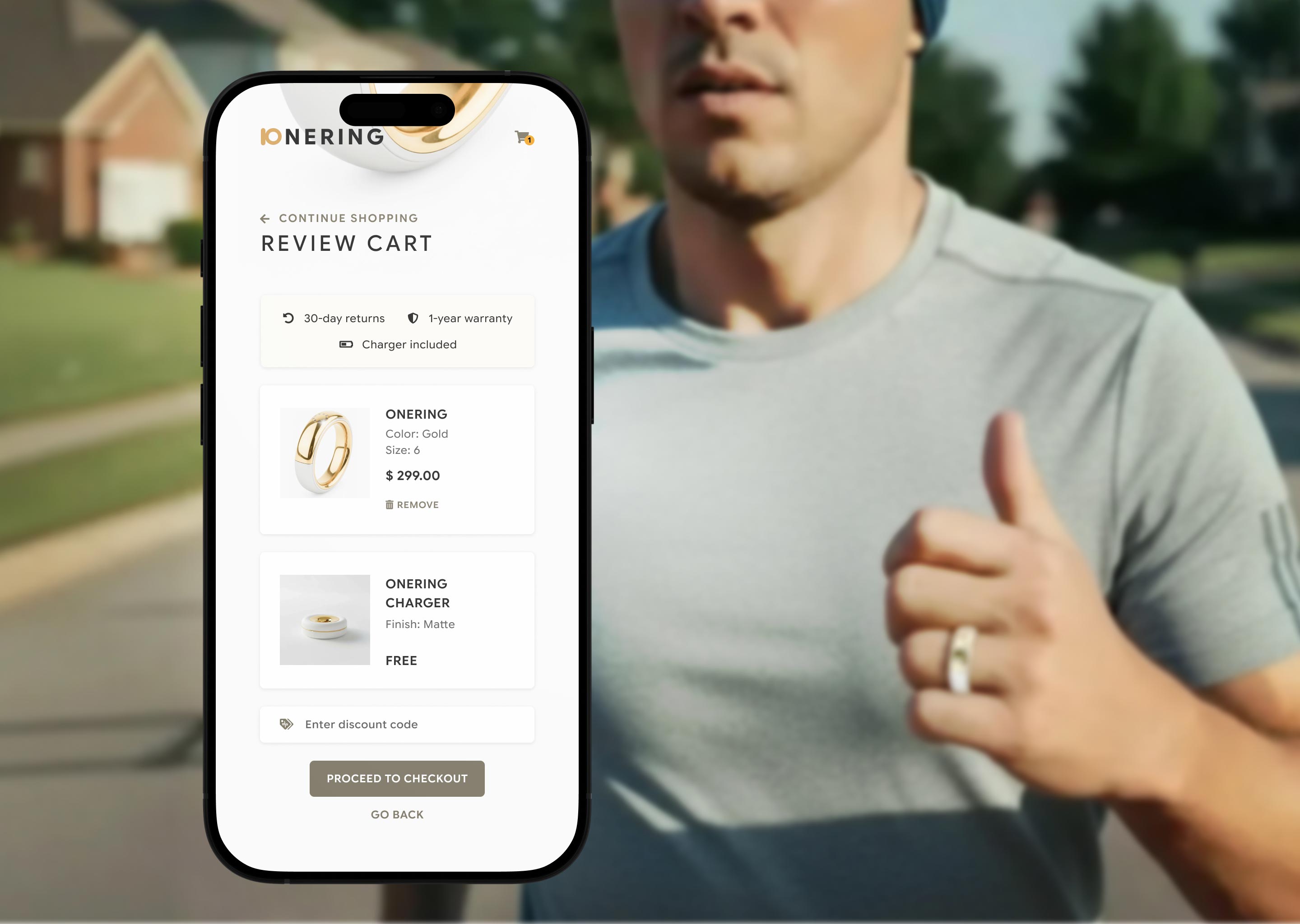
In mobile, the challenge was to not overwhelm users with all the information they had to see. Given this, I considered proper text hierarchy of utmost importance. I emphasized the product name and price, and kept the action button REMOVE near the price. Despite the limited amount of space, I made sure to keep at least 20px of breathing room around the tappable elements to avoid accidental pressing — this happens a lot more than we might think.
Given more time, I would flesh out the rest of the purchasing process, or maybe create a full-fledged product page for the imaginary product. Who knows? Someday, this imaginary ring might just be a reality.