100 Days of UI Challenge - Landing Page
Redesigned the RingConn Gen 2 landing page as part of the 100 Days of UI Challenge
- Client
- Personal Project
- Role
- UX/UI Designer
- Years
- 2026
Challenge
Still in my smart ring phase, I decided to revamp the RingConn Gen 2's website. They had a wealth of information in the hub which had its pros and cons.
On the pros: all the key information needed to make a purchasing decision was already there. But on the cons: the styling of the elements was inconsistent, and the content themes jumped around from one topic to another, making the browsing experience suboptimal.
Action
To improve the layout, I made the following changes:
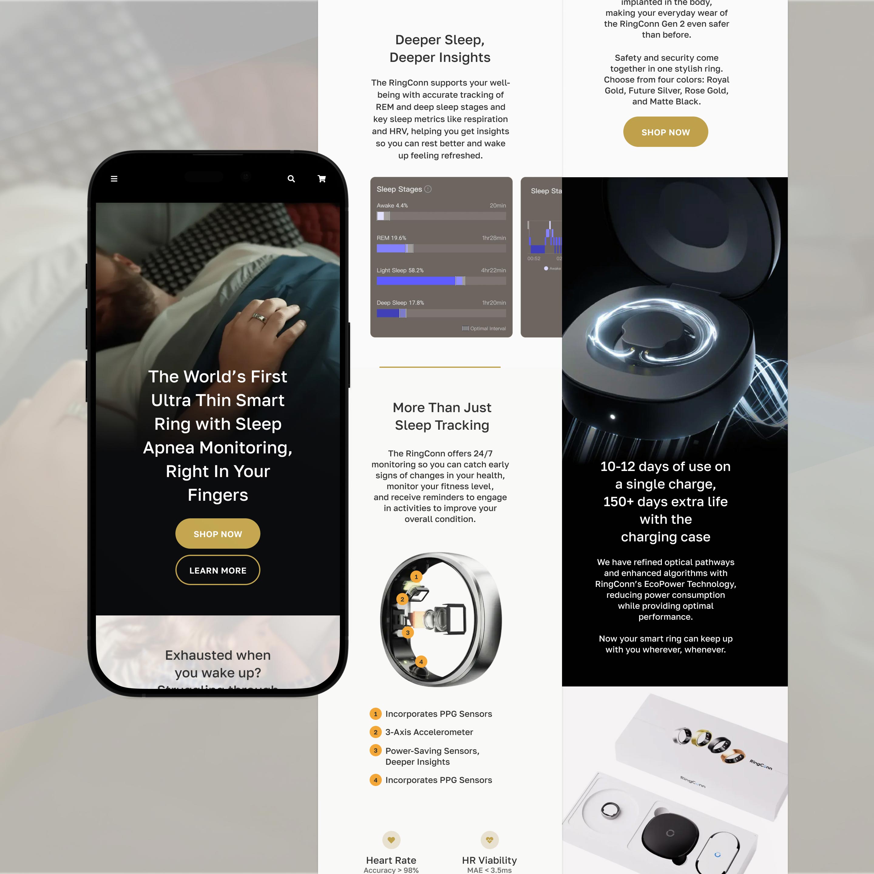
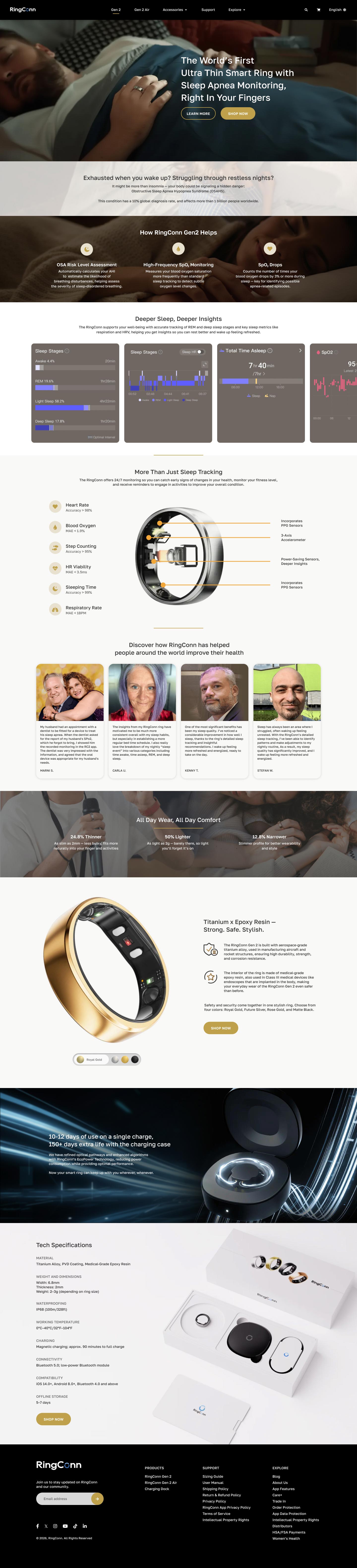
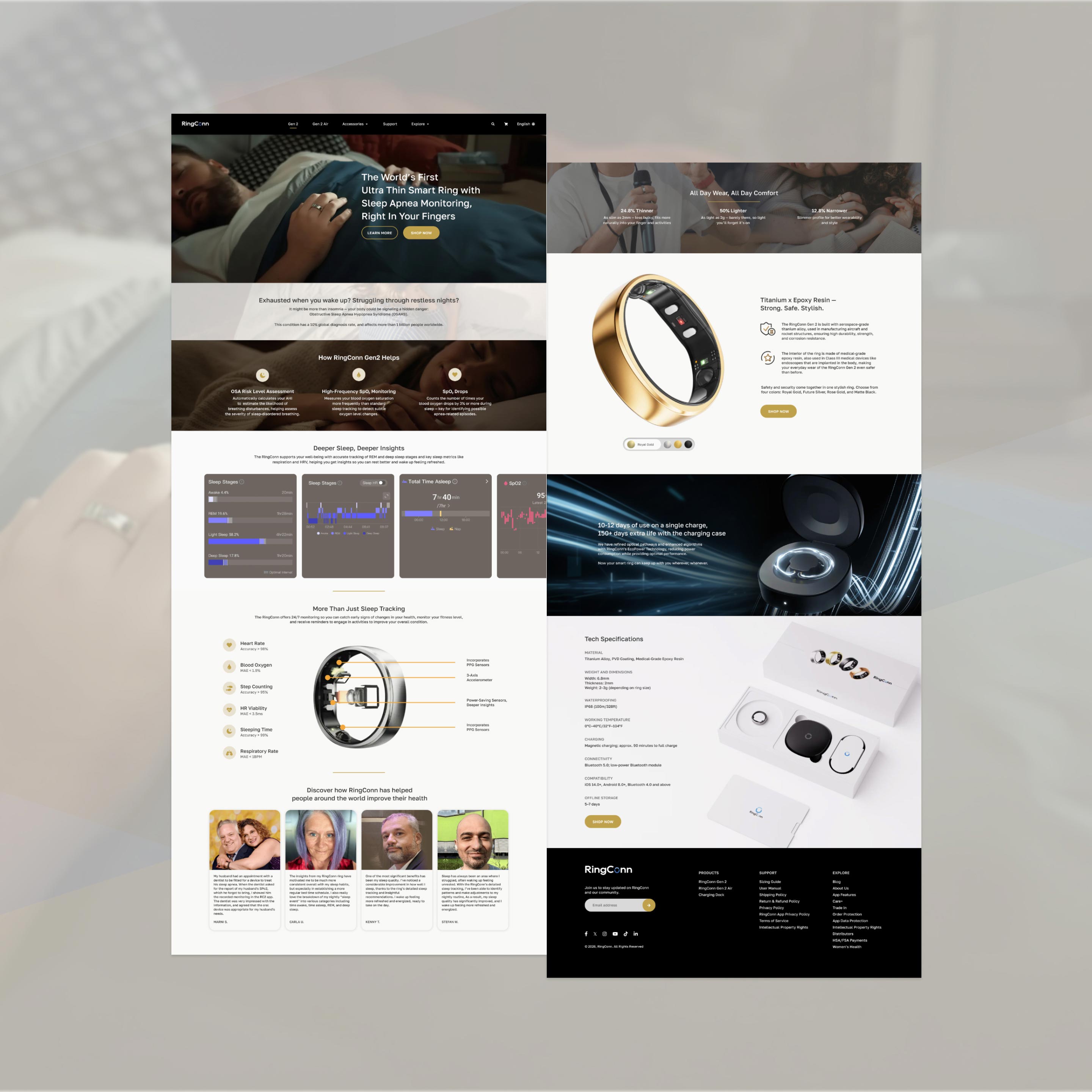
First, I reworked visual cues that could cause branding confusion. Instead of having 4+ colors on the site (i.e. multi-colored icons, blue buttons), I reduced the highlight colors to just 2 — gold and brown. This aligns with the flagship color of the RingConn Gen 2. To help manage eye strain, I changed the pure white background to a soft and warm beige. Additionally, I changed the website font face from Helvetica Now Display to Golos Text — a smoother, rounder font face — to better align with the overall branding.
I also reworked the banner header completely. The RingConn Gen 2's claim to fame was that it is the first smart ring with sleep apnea detection but the accompanying visual did not communicate the same message. Given this, I repurposed one of the images in the site and used it for the banner header to highlight sleep apnea detection as a core feature of the ring.
I also made optimizations to the content, condensing long pieces of information or trimming them out to reduce content overwhelm. I placed the OSA Risk Assessment and SpO2 monitoring snapshots in a single row instead of a long column for easier reading and to reduce scrolling. This new approach to the layout also makes it easier for users to consume the content on a single screen.
Additionally, I moved up the feature breakdown section for the RingConn Gen 2, closer to the sleep insights section, for continuity. This allows users to seamlessly transition from consuming sleep tracking-specific information to seeing the other benefits of wearing said smart ring. Then, to further strengthen RingConn Gen 2's claim to fame, I placed the customer reviews right after the features section.