100 Days of UI Challenge - Calculator
Designed a calculator as part of the 100 Days of UI Challenge
- Client
- Personal Project
- Role
- UX/UI Designer
- Years
- 2026
Challenge
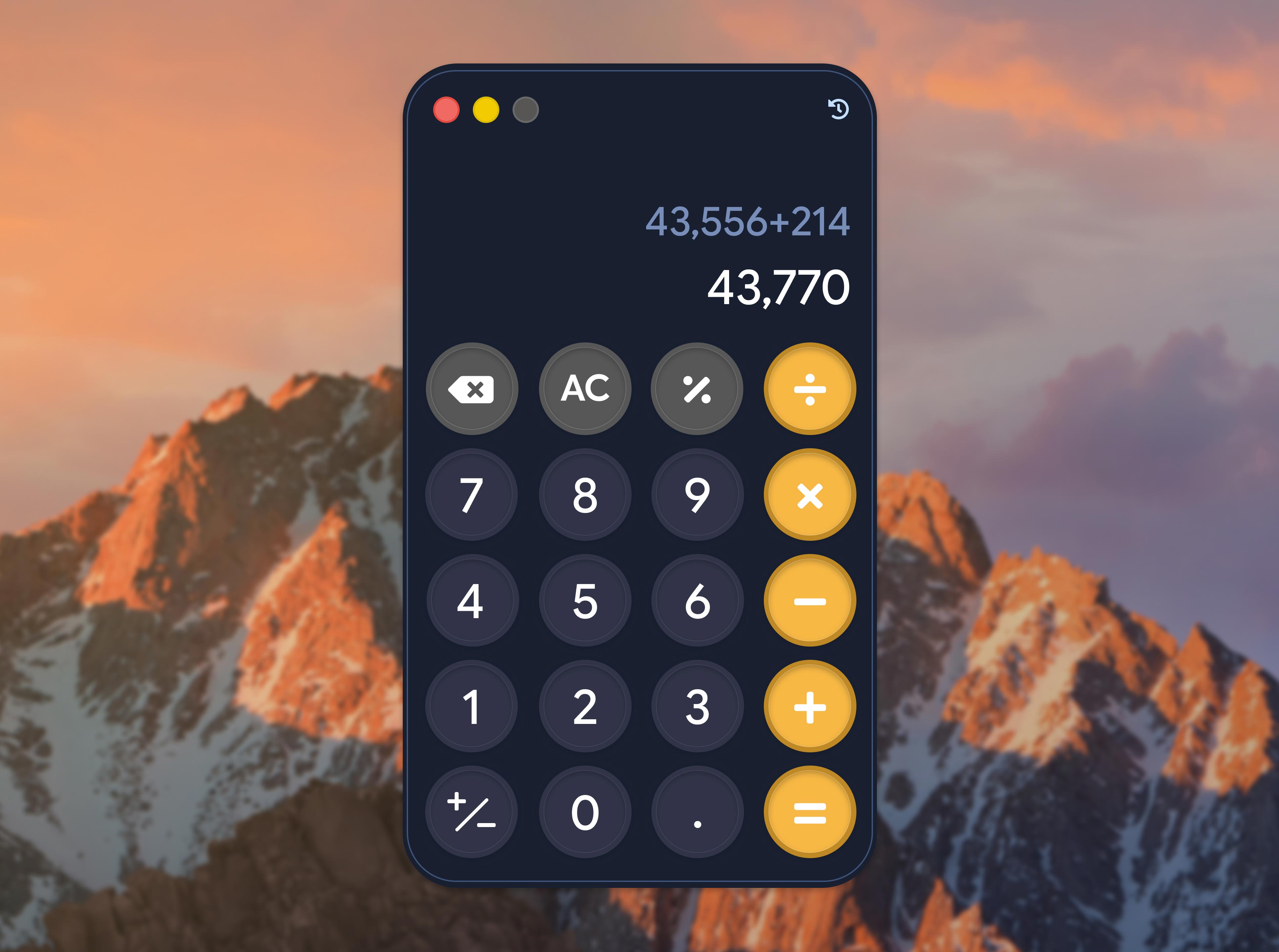
Designing a calculator is, believe it or not, difficult. It’s not just a bunch of numbers arranged in order — all the keys in the calculator need to make sense at a quick glance because it’s a tool meant to bring convenience. Operations need to tell a story. The main screen needs to hold at least eight buttons — what users are historically accustomed to seeing — or usually ten. All while not looking overwhelming.
I decided to add another ounce of difficulty to this challenge — I was determined to put the "fun" in "functional".
Action
As colors largely contribute to the overall look and feel of any user experience, I went with a deep indigo as the background color, a slightly less saturated indigo for the primary button color, and golden yellow for the operator buttons. For the font, I went with Google Sans Flex to keep the text clean but also fun and easy on the eyes.
I tried to use the same styling on the Figma Make prototype for this (check out the link above), but the tool has some restrictions when it comes to layer styles overlapping. To ensure that the prototype can be usable on both desktop and mobile, I implemented dynamic text sizing through Figma Make. The calculator is fully functional on both desktop and mobile, and also works with a keyboard.
Huge respect to calculator designers around the world. You all are the unsung heroes of the modern era.